Saturday, March 29, 2014

Market Summary: This is not 2013...


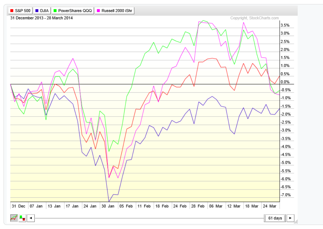
So far in 2014, market returns on the equity side of the allocation have been hard to come by. After 61 trading days for the year 2014, only the S+P 500 is showing a slight gain (below 1%). The Dow, Nasdaq and Russell 2000 (small caps) are all in negative territory year to date, although not by much.


Let's rewind to year 2013 and we see that the first 61 days last year proved to be much better for equities. At this point last year, three out of the four major averages were sporting double digit returns already. 


In January of this year the S+P 500 matched it's biggest correction of 2013 before rebounding and making another all time high. The market is currently stuck between a range defined by 1840-1880 swing high/low pivots. However even with all the recent volatility the S+P 500 remains only 1.5% off it's all time highs.


This 60 minute chart above shows this recent trading a little more closely. A break below 1840 sets up the expectations for a drop to at least 1809-1799, the zone that is marked on this chart above. Of course a break above would likely setup the expectations for a rally to new highs to 1940 or so. 


The Dow Jones average has been in negative territory all year after hitting long term resistance projected in the pattern we defined going back to last year. The Dow started off the year by matching and slightly exceeding it's biggest correction size of 2013 before rebounding. Unlike the S+P 500 it failed to make new highs on the rally and now sits inside a similar trading range to the S+P 500. 


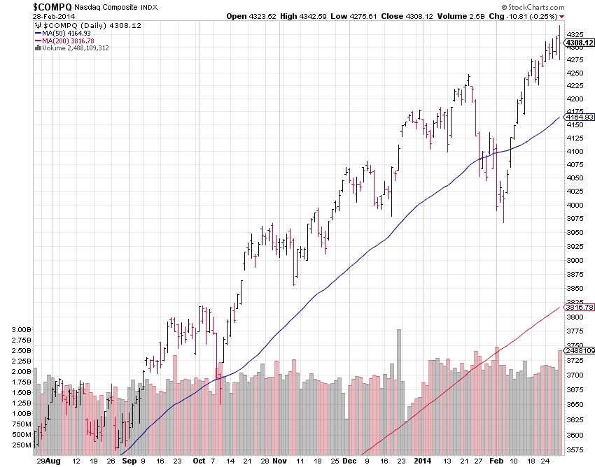
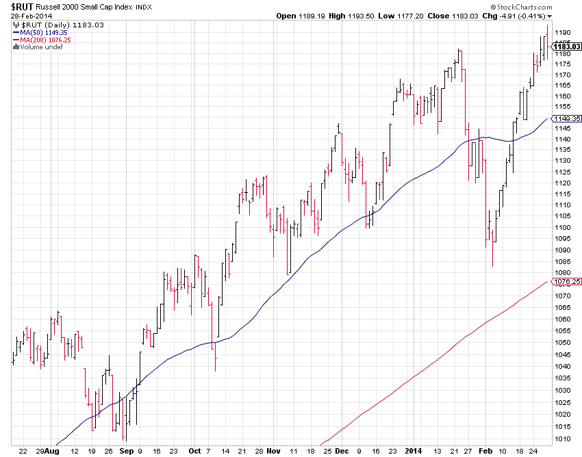
The Nasdaq also matched its biggest correction of 2013 during the January drop. However more recently we have seen more weakness in the small caps and the tech heavy NASDAQ. While the S+P and Dow continue it's trading ranges the Nasdaq and Russell have actually broken down a bit. The Nasdaq is 5.5% off it's highs as of Friday's close.


The Russell 2000 is also 5% off it's highs and has made a recent lower low as it dips below it's 50 day moving average. The Nasdaq and Russell still remain in bullish up trends however this weakness is worth noting as it signals a possible reduction is risk taking. 


The market internals still look strong as both the New York Stock Exchange and the S+P 500 advance - decline lines remain in solid positive territory year to date.


New 52 week highs on the New York Stock Exchange are in short term oversold territory as the bearish divergence continues.


Another bearish divergence can be found when looking at the spread between high yield bonds to treasury bonds. A higher reading means investors are more willing to buy higher yielding (riskier) bonds in place of (safer) treasury bonds.


Sector performance year to date shows Utilities taking the clear number one spot, showing returns of 9%. Health care has been under pressure of late due to the recent volatility in Biotech, which now makes up almost 20% of the sector. Cyclicals, 2013's best performing sector, comes in as the biggest under performer as of Friday's close.


Asset performance year to date continues to show relative strength in Treasury's and Gold, while emerging markets is starting to show some life but still comes in as the laggard year to date so far.


The trend matrix continues in it's bullish theme, although slightly less bullish than it was two weeks ago. As the Nasdaq 100 (QQQ) small caps (IWM) and Consumer Discretionary (XLY) sector turn from a Bullish to Neutral trend reading. This is not a market timing tool but rather a gauge of the direction of the dominant trend and the strength thereof.

Another indicator I follow is how many stocks in the S+P 500 are in bear market territory. I use stocks trading below 20% from it's 52 week high as my criteria. Last week the reading came in as 6% of S+P 500 stocks in bear market territory. As of Friday's close that number has now gone up to 7%. Still far from danger territory but worth watching nonetheless.

In conclusion, I am still concerned with the potential downside risks in equities over the short term. However with all four of the major averages in up trends above their 50 and 200 day moving averages and the market internal readings as strong as ever, there is absolutely no reason to jump the gun and start crying market top. Investors expecting 2013 type returns from equities may very well be dissapointed, but that doesn't mean we can't get a 10-15% return in equities by year's end. All it proves is the importance of diversification among asset classes. Those investors that chose to re-balance their portfolios by rotating some of their stock earnings into their bond allocation have been rewarded.

Friday, March 28, 2014

Twitter (TWTR) price chart update ...


There is a saying that goes "the market tends to do the expected, but in unexpected ways". I bring this up in regards to twitter stock because all I heard going into it's IPO was how everyone wanted to be a buyer around the mid to low $30 level.

The daily price chart above goes all the way back to Twitter's IPO last year. In my last comment I made on this particular stock I mentioned how the stock price had fallen back to it's IPO high (horizontal white line) and how it needed to hold that level if it had any chance of continuing higher. We did get a short term bounce off that level but the selling pressure has remained for fundamental reasons, as it's first quarterly earnings report left a lot to be desired.

Twitter has now dropped 42% off it's highs and is down 27% year to date. A full 50% retracement from highs drops the stock price back to it's lows at $38. Investors may very well get their low to mid $30's price point that they clamored for during it's IPO, after all.


However this is not unusual for growth stocks in their infant stages, and doesn't necessarily mean that Twitter is a broken stock with no future. Let's take a look at a couple recent and very popular names. Facebook (FB), chart above, dropped 61% off it's IPO high price, albeit for different reasons.

The stock eventually found support, fundamental factors kicked in to support the stock price and it has rallied higher over 313% in the last 18 months since.


Tesla (TSLA) experienced drops of 50% during the first week of it's IPO and 42% a few months later.


It's now some 1200% off those lows over the last 3 and a half years.

Of course there are plenty of other examples out there. The purpose here is not to compare twitter to any of these others. I certainly have no idea whether twitter will take off in similar fashions or not. I am not long any of these names but would seriously consider twitter in the low to mid $30 range if it did happen to get there.

The purpose here is to show that although these names are popular and have a lot of hype surrounding, they are awfully volatile and should be treated as such. If you can stomach these 50-60% corrections in a short amount of time then they may have a place in your portfolio. Otherwise don't get sucked into all the hype and emotions.

Wednesday, March 19, 2014

Market Update: Post FOMC observations...


The stock market saw a bit of a sell off today as the FOMC statement and press conference took place. The entire statement can be read here but basically the Federal Reserve continues to stay the course of tapering it's bond buying program by another $10 billion a month but drops it's 6.5% unemployment rate threshold.

The S+P 500 chart above depicts how each of the three tapering statements has been digested. The initial announcement in December of 2013 saw the markets move substantially higher. The second announcement was not greeted as well as it kicked off a 60 point drop in the S+P.

Today's announcement traded more like the last. So I think if the market spends much time below it's year to date break even point (yellow horizontal line) a similar drop taking the S+P to 1815 and 1770 is quite possible.


Gold, still outperforming by a clear margin, has seen some recent short term selling pressure as it nears a key pivot high at $1434. Today's drop marks the biggest correct seen in Gold year to date. Near term support comes in roughly at $1330 but expect some short term volatility around this level as there remains a lot of "congestion" left behind in a cluster of swing highs and lows.

One pattern I see in Gold is the day after each taper announcement has taken place, Gold has ended in the red. This is quite a small sample size to get any real edge one way or the other. The next potential downside pivot I see is the low at $1308. This would be almost exactly two times the size of the last short term correction (a common occurrence) and the midpoint of the entire run up from it's low at $1180.


Interest rates spiked today as bond prices fell. The yield or interest rate on the 10 year treasury bonds rose over 3% today. An interesting observation is denoted in the chart above, the horizontal lines show the settlement price on the days QE 1 was announced. This most recent trading range has engulfed those two prior pivots and it appears interest rates are higher now, then when they were when QE 1 was expanded by over $1 trillion of MBS and treasury debt/securities.


Lastly, taking a look the US dollar via the spot futures continuous contract. I've denoted the $84.50 level (grey horizontal line) which is the settlement price of March 18th, 2009 (QE 1). During the entire time where the Federal Reserve was significantly adding to it's balance sheet, the value of the USD fluctuated from positive 5.2% to negative 13.79%, according to the futures price chart. And the actual swing low came in 2008 before quantitative easing had begun.

Now it's quite obvious on the chart above that the USD had experienced significant devaluation leading into the financial crisis and Fed response. It's quite possible that the market began to price in what was to come, will in advance. Regardless the drop in the USD was 40% from the 2001 high to the 2008 low. And all without more than a brief 38% retrace rally during the financial crisis of 2008 where investors fled from risk assets and demanded USD and treasury bonds.

It's clear from a technical point of view that the USD is still well within a long term downtrend. For me it would take a break above the $90 level to begin to think otherwise. Until then a revisit of 2008 lows is quite possible.

Friday, March 14, 2014

Stock Market Summary: As the Bull Market turns 5 years old...


The S+P 500 is now 2.25% off it's all time highs as concerns over China growth, Russia, future monetary policy, among others, abound. Recent history has shown the S+P 500 put in a higher high on average of about 35 points above it's previous (as denoted on the chart above). This pattern seems to be continuing as Friday's close has completely wiped out all the gains that came about last week as at that time a possible diplomatic solution to the situation in Crimea seemed possible.


The situation in the Dow Jones Industrial Average appears even more short term bearish as the average closed below the low of it's previous week after retested the long term resistance area once again, an area we have pointed out beforehand numerous times. Perhaps signaling the beginning of a short term trend change.


We saw a sharp spike in volatility and put protection as the VIX found support on 3 separate occasions in the last month at the 13.50 level. It's quite possible we once again test the upper end of this range in the 20-21 area before it's finished.


One of the bright spots has been Health Care and Utilities. The Utilities sector price chart above shows how it's bucked the trend of the broader market by finding support early in the week and rallying to a new closing high.


The advance - decline lines of both the New York Stock Exchange and the S+P 500 index remain in strong up trends above their 50 and 200 day moving averages and prior swing highs.


The sector performance year to date continues to show investors risk appetite to be light as the majority of the gains come from the Utilities and Health Care sector, mainly considered "risk off" or more "risk averse" investments.


The year to date performance by asset class reinforces this "risk off" theme as Gold and Treasury Bonds come in as 2 of the top 3 performing asset classes so far in 2014. I've added Real Estate by using the exchange traded fund IYR. In fairness and keeping a balanced approach we must ask ourselves, is this recent performance just a "value play"? (as Gold and Bonds were two of the worst performers in 2013 and Utilities was the worst performing sector for 2013) Or the beginning of a larger risk averse theme that often times precedes a significant market correction?


The trend matrix this week continues it's bullish stance as 16 out of the 18 components remain bullish with 2 neutral. The best advice for most investors (especially new ones) is to follow the trend and to not get too caught up in all the noise surrounding you, put your blinders on so to speak. As an investor just try to focus on what you can control and quantify (which is current market data).


In conclusion, we have come to the fifth anniversary of the bull market that began in 2009. The last major bull market we had ended at it's 5th year but that by itself doesn't mean it is going to happen to this one as well.


I've highlighted the corrections we have experienced in these five years, to go along with the breakdown of the previous bull market I did last week. The first thing you should notice is that although this current bull market has surpassed the returns experienced in the 2002-2007 bull market, the volatility during has been much greater and harder to endure. During the 2002-2007 bull market we went over 4 years without a 10% correction. During this bull market we have already had 3 separate corrections of over 10%, including a 21% drop in 2011.

Like the saying goes "no pain, no gain". And while the doom and gloomers have continued to push their messages and agendas through every available medium, they have scared ordinary investors half to death. And while they wait for their 30%, 40% even 50% or more "crashes" in the stock market the S+P 500 has nearly tripled off it's 2009 low.

This next week will likely be a key week on both a technical and fundamental level. On Wednesday the new Federal Reserve chairman Janet Yellen will be holding her first press conference as Fed Chair, possibly giving more indications of future monetary policy and economic projections. And of course the events unfolding this weekend in Crimea may very well have at least a short term impact on the stock market as well.

Thursday, March 13, 2014

Gold price chart update (GLD, IAU, /GC)...


It's been awhile since I last created a post on Gold. The weekly chart above shows continuous spot future contract prices on Gold since the bull market began in 1999. I've highlighted the significant corrections inside, we can see this current correction is indeed the largest experienced since the 1999 bull market began.

However I don't see this as a tremendous problem because as you can see each correction has been bigger than it's predecessor the entire way up. And Gold continues to trade above it's midpoint of this long term bull market.


A closer look at this current correction reveals two very similar trading ranges. A double bottom at $1524 resulted in a double top in the $1790 range, the low of this range was breached last year in a couple of days of heavy selling.

We now find ourselves in a similar situation as Gold has come off a double bottom low at $1180 and looks poised to head back up into it's previous swing high at $1434. Will this create another double top situation that becomes the catalyst to send prices further down below $1180? It's hard to tell at this point, the main thing is to pay attention to the important pivots.

Taking out $1434 to the upside would make a high probability of trading at least as high as $1550 which happens to be the midpoint of this current correction and also the breakaway gap left behind when Gold tumbled last year. This is likely to be an important level and it's also possible that the energy created by this trading range could help propel prices much higher on a breakout.


Of course we do have to talk about the other side of the coin. If Gold where to fall below it's double bottom at $1180 that would obviously be very bearish. The very first chart above I've highlighted the multiple highs Gold left behind in 2008 when it created it's inverted head and shoulders pattern before it really took off into the year 2011. That price level is around the $1000 level and it also about marks the midpoint of this entire bull market.

I would estimate that would be the minimum downside target in this scenario. I would estimate the higher probability downside would come in around $840 which I have depicted on this historical chart above. This happens to be the high of the last major bull market in Gold that ended in the year 1980.


It's difficult to predict the exact course of Gold prices will take (or any investment vehicle for that matter). What we can't deny is the relative strength this asset class has experienced year to date. As the chart above shows, Gold (GLD) has a year to date gain of over 13% while the S+P 500 struggles to stay above it's flat line. And it happens to be the best performing asset class of the ones that I follow closely.


However even that performance is not entirely foolproof, a small sample size but in the last 5 years the last time Gold started the year off this well in 2012 it remained relatively subdued the remainder of the year.

Saturday, March 8, 2014

Anatomy of a Bull Market (2002-2007)...


The last major long term rally in stocks occurred around October of 2002 and topped out in October 2007, measuring 5 years in total. If you are in the camp that the current bull market began in 2009, then we have a current bull market that is also reaching it's 5th anniversary.

I've decided to take a closer look at that previous bull market, specifically the corrections that occurred within. The chart above encapsulates the entire five year bull market run and it shows a relative lack of volatility within. 

Actually I must confess I was a little surprised to see that within, there was over a 4 year span where the S+P 500 did NOT suffer even a 10% correction. I've noted the correction sizes in the chart above. 

In next week's post I will break down the current bull market off the 2009 lows. But I think this is interesting to note because our current rally has seemed to go on for so long without a "meaningful" correction that everyone is waiting for. But according to this chart, recent history has shown longer periods of time where the stock market did not pull back in a meaningful way for awhile.

Financial Sector (XLF) breakout...


In last weeks summary we noted the under performance of the financial sector. And seeing as the financial sector accounts for over 16% of the S+P 500 and the second largest sector, it was something worth keeping an eye on.

This week we got some encouraging performance from the financials as a whole as the chart above shows. The XLF broke well above it's 2013 highs on a closing basis.


The sector performance this week shows many of the "risk on" sectors performed well during this weeks rally. As the financial, industrial and consumer discretionary sectors lead the way. Couple this with the strong readings from the advance - decline indicators and the major averages themselves, this does bode well for short term future stock market prices as a whole.

I still remain rather unenthusiastic about the risk to reward at current stock market prices, as how much higher can we go without a meaningful correction? However I still advocate a balanced approach for investors where one doesn't need to sit in cash and listen to the doom and gloom, but also doesn't go all in with all the leverage and beta one can find, either. There are plenty of different methods described in detail from some stellar bloggers like the ones I have listed on my favorite sites list.


The sector performance year to date continues to show relative strength in the Health Care and Utilities sectors but this week the cyclical sectors have closed the gap as the S+P 500 moves into positive territory for the year 2014.

Saturday, March 1, 2014

Stock Market Summary: Mixed signals as S+P 500 turns positive for the year...


This week the S+P 500 turned positive for the year to date while also making another new all time high.


The Nasdaq and the Russell 2000 (small caps) also made new bull market highs.


The Dow Jones Industrial Average is still trading below it's 2013 highs and long term resistance. Although with the momentum being made in the other major averages it's likely the Dow will take another run back up into long term resistance. And if successful, a push up above 17,000 is likely. As that would match the size of the last 1800 point rally the last time the Dow tested it's 200 day moving average at the end of last year.


It's look to me that the next logical upside target comes from the S+P 100 (OEX). The chart above shows this large cap index is still trading below it's 2007 highs. But those highs are approaching about 3.5% away from Friday's close. 


Now there are some mixed signals to monitor as well. The sector performance year to date shows the bulk of the gains coming from the Health Care and Utility sectors. 


The Financial sector, which accounts for approximately 17% of the S+P 500 and the second largest sector (Technology being the first). Has failed to make new highs and so far has struggled to regain positive territory year to date.


Also the spread between high yield and treasury bonds continues to remain in neutral territory. Catching a bounce off it's 200 day moving average back into it's 50 day moving average. Credit market indicators like this can be helpful in the context of a full market analysis. 


However the market breadth for this advance has been stellar. Judged by the cumulative advance-decline lines (New York Stock Exchange - top chart, S+P 500 - bottom chart). Both indicators are making new highs and trading well above their 2013 highs. This shows a broad based advance on both fronts, it's hard to get a major trend change with internal readings as strong as this.

The performance by asset class now that we have two months in the books, continues to show Gold and Bonds out-performance while the S+P 500 turns positive.


The trend matrix continues it's bullish stance, actually getting a little more bullish as the Consumer Staples sector turns bullish from neutral. I have also replaced the telecom sector with the Dow Jones Transportation Index. This tool is NOT a leading indicator that spots tops and bottoms in advance, rather it's a useful tool to gauge the overall trend and the strength thereof, thus helping to define the risk/reward, and most importantly filter out the noise.

So in conclusion, even though I'm not excited about the risk to reward at these price levels especially in light of the fact that we have moved quite a bit higher over the last three years without a meaningful correction. It's important to remain flexible with your analysis. There is absolutely no reason to be a hero and try to pick market tops. The bottom line is, for now, the trend's are up and the bulls remain in control. With that being said it's also prudent to remain balanced and not become overly enamored with these big moves and end up taking on more risk than one really can tolerate.

Safe investing and trading!