Saturday, June 29, 2013

Market Update: Still more downside remaining...


Last week we talked about the continued short term weakness in the broader markets and how this was likely to continue for a few more weeks (our 9 week cycle). So it was no surprise to us to see Monday mornings gap down creating yet another lower low. Although we have since seen a sharp and fast rise back above 1600 on the S+P 500, a move that tends to be typical during corrections. Despite this move higher I continue to believe this correction phase will last a few more weeks. As neither our price or time targets have been achieved, this leads me to believe there is still some more downside remaining. This week will be a holiday shortened one that concludes with the big Non-Farm Payroll report on Friday morning.

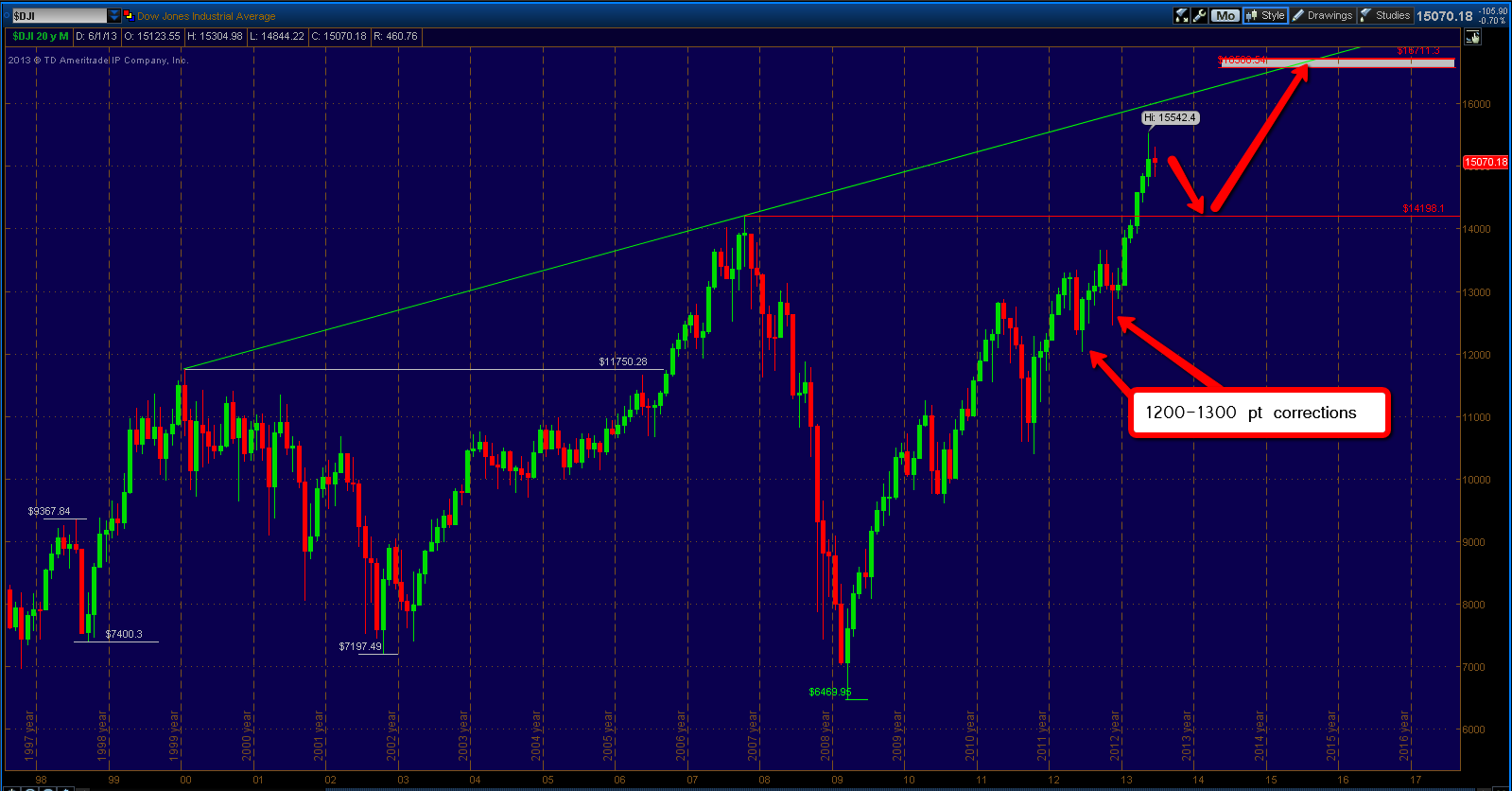
The chart above sets the stage, it is a weekly chart of the Dow Jones Industrial Average dating back to the 2007 bull market high (Red horizontal line). We continue to trade above that key zone and I think this correction will get close to testing this area below before that strong support zone is found.

 
Let's drill down a little closer now and look at the S+P 500. This chart above shows the daily trading in the S+P 500 cash index since the May 22nd high. So far we have had two separate drops of 90 points in length. And as of Thursday's swing high, we now have two separate retracement rallies of about 60 points. As I mentioned in the introduction, this upcoming week is a holiday week so even if there is any low volume "melt up" I still fully expect that rally to fall below the 1654 swing high, somewhere in the vicinity of the yellow zone I have marked on this chart.
 
After that we can expect another equal sized drop, probably to the bottom rung of this price channel. Monday's swing low produced a lower low of about 38 points below the previous swing low. Another lower low of equal distance would equate to roughly 1522. So as you can see there is a lot of confluence below that should eventually provide for a strong support zone that will take us to new bull market highs on the major averages. Right now the worst possible scenario I can see is another 130 point drop which would take us closer to the 1500 level on the S+P 500. In either scenario we'll be making new bull market highs by year's end. Once we get there we can talk in more detail about what we should expect soon upside targets are reached.
 

Let's take a moment to take a look "under the hood". As we saw last week the cumulative Advance - Decline did confirm with a lower low. We have had a relatively sharp retracement this week but still trade below the last two swing lows.

 
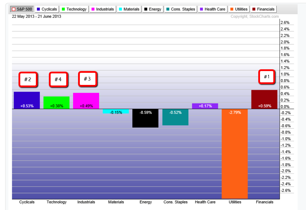
Examining sector performance since the May 22nd high shows us the strength lies in the Financials, Cyclical and Industrial sectors. While the laggards now become the Materials, Energy and Utilities.
 
So in conclusion, not a whole lot has changed since last week. We still are in the middle of a short term bear market that thus far shows no signs of letting go. However the Longer term trends will soon come into play which I fully expect to present strong enough support to turn these short term trends around in a hurry. 


Saturday, June 22, 2013

Market Update: More Downside Remains...


Last week we talked about the importance of the FOMC statement and press conference of Fed Chairman Ben Bernanke. The importance was more so on how the market reacted to the statement then the actual statement itself. We also noted the weakness in the market internals and sector performance and how that was likely to continue. And that is exactly what we got, after beginning the week positive the stock market continued it's sell off after the FOMC statement on Wednesday afternoon and then into Thursday and the Friday morning session before finding some short term support.

So what is likely to happen next? As I said all along, I did not think the 1600 level on the S+P 500 was strong enough to support a rally to new bull market highs. That proved to be correct as we find ourselves trading as low as 1577 this week. This means in my opinion that we still have some more downside to go.

I'll reiterate my belief that strong enough support will not be found until the 1550-1530 area, with emphasis on the lower end of that range. In the chart above (Weekly chart of S+P 500) I have highlighted the last two market corrections since the beginning of 2012. One interesting thing of note is that each correction lasted exactly 9 weeks before bottoming out. That would equate to the week of July 22nd to July 25th for a potential key turn date.

Now I do believe that price is more important than time, but time is still an important piece of the puzzle of speculation. If 1530's traded next week I would certainly take the long side even though it would only be the 5th week of the correction.


Now let's drill down a little closer, this chart above is a daily chart of the S+P 500 so we can see the price action a little clearer. Since the May 22nd high we have had two retracement rallies of 40 to 50 points in length. Friday we hit the lower end of this price channel so it is certainly possible to get another equal sized retracement rally up to the strong resistance point marked on the chart, as well as the upper rung of the price channel. I expect any such rally to stop at or below that level and then proceed to the final destination. If you look clearly at the chart above you can see that the bottom rung of this price channel on the dates of July 22nd to July 25th (our key turn date) comes in around the 1540-1530 price level. That looks about right to me!


Taking an updated look at the cumulative Advance - Decline line we see continued confirmed weakness and another lower low.


Our sector performance for this week was a mixed bag, as opposed to last week's which clearly signaled risk off. This week we see some strength in the cyclicals and financials but also weakness in technology and energy.


This chart above shows the sector performance since the May 22nd high. Financials now have the highest relative strength followed by cyclicals, industrials and technology. As of right now, this does not seem to have the characteristics of a major market top before a significant drop.

So to sum up, in the very near term we should expect some type of retracement but most likely proceed lower into strong support. If we do see that resistance level above taken out, I'll conclude that the correction is over. But most likely we should see lower prices over the coming weeks. In either case once this correction concludes, a march to new bull market highs will commence, taking the Dow into the 16,500 level. We will discuss that in more detail when the time comes.


I will conclude this week's market update to take a minute and talk about Gold. Commodities came under significant selling pressure during this week's market correction. Now Gold comes into some significant price levels and deserves to be mentioned going forward. This chart above is a weekly chart of Gold spot futures contract. This chart was used during a post on my blog that I created on May 12th outlining key price levels going forward. In the post I talked about how I felt the odds where that we would end up making another lower low before the market found support.


And here we are, we find Gold now trading at the strong support level highlighted in May. I am unsure at this time, if this will become strong enough support to take Gold prices eventually to new all time highs. But I believe it is good enough for a retracement rally back into the $1526 level which is the major swing low that I have marked on the chart.

Saturday, June 15, 2013

Market Update: Dow and S+P, Advance-Decline and Sector Performance...

 
This week saw the market spending almost all of it's time trading below last week's close. And although none of the "Big 4" indices actually put in a lower low, the rallies haven't been stellar either. Next week we have an FOMC statement and press conference with Fed Chairman Ben Bernanke. Because of this, it's likely we get more clarity on direction in the short term this week.
 
Either way, this is what I am looking for. The chart above is a monthly chart of the Dow Jones Industrial Average. Since the 2011 low the Dow has put in two corrections of about 1200-1300 points. We also have the 2007 bull market high coming in around the 14,200 price level, which would coincide with another 1300 point drop from all time highs. I conclude that any further weakness will most likely be contained in that strong support zone.
 
The next major move in the Dow will take it into what I perceive to be strong resistance in the (16,580.54-16,711.30) price zone. It is from this zone that I believe there is a very strong chance of seeing a good 10% - 20% correction begin.
 
 
A weekly chart of the S+P 500 is above, it has a similar setup to the Dow also. There has been three corrections noted on this chart, 2 corrections of 130 points and 1 correction of 150 points. I do not believe this pattern will be broken on this correction and that any further weakness in the major average will be contained by the 1530 area and the rising trend line. The next major move in the S+P 500 will take it up to the 1750 price level.


This chart above is the cumulative advance - decline line for the stocks trading on the New York Stock Exchange. This chart has put in a lower low this week, so there is a signal of short term weakness "under the hood".
 
This chart shows the performance of each of the S+P 500 sectors this week. Financials underperformed immensely by over a 2 to 1 margin to the next weakness sector, that being Energy. Technology being the third weakest sector for the week.
 
So in conclusion, in the short term the internals do suggest some further weakness. However if Ben Bernanke suggests no tapering of it's QE3 bond buying program, I would assume the market would take that well and that any short term internal readings would be made null and void.
 
In either case, overall, the Dow and the S+P 500 are headed for one more all time high before the possibilities of a deeper correction are realized.


Tuesday, June 11, 2013

Comparing the last two long term trading ranges (1966-1982 + 1998-2013)...

 
I thought it would be interesting to take some time and dissect some of the price action that occurred during the last long term trading range in the major averages, and then compare that price action to the current long term trading range that we have presently broken out of. This is meant to sort of piggyback off one of my previous posts that used some analysis of historical price action to come up with a 150,000 price target on the Dow Jones Industrial Average over the coming decades. Please note that the intentions for both of these posts is to attempt to bring a different perspective to some of the stuff out there, and to give readers with an open mind some food for thought. It is strictly from a technical standpoint and not a guarantee or even a prediction for that matter. I am well aware that market patterns can be broken at any time and that just because the market pattern exists that doesn’t mean they will continue to work. So let’s dive in!

The chart above is a monthly chart of the Dow Jones Industrial Average during the last major long term trading range beginning in 1966. I have highlighted the three highs on the chart along with the price level and date it was put in, as well as highlighting the price level of the three lower lows, the date and size of the decline. Note that once the third lower low was formed in 1974 after a 47% decline in the average, a bull market emerged that took the Dow to new all-time highs and although there were bear markets along the way like in 1987, the major averages never really looked back.
 
Now let’s take a look at the price action during this current long term trading range. This chart above is also a monthly chart of the Dow Jones Industrial Average. Likewise I have highlighted the price level of the three higher highs, along with date. As well as the three price levels of the lower lows, date and the size of the decline. Now let’s take a look at the similarities, first off we have a similar pattern of three lower lows, each producing bigger drops than the previous. Notice also the similarities in the size of the declines in terms of percentage. The 1966-1982 trading range produces three drops of 26%, 37% and 47% respectively. The 1998-2013 trading range produced three drops of 21%, 39% and 54% respectively.
 
Now if you recall during the 1966-1982 trading range the third low was the final low before the real breakout. Now we find ourselves in a similar predicament where our third low produced back in 2009 has been followed by a legitimate breakout to new all-time highs on both the Dow and the S+P 500. Will it hold? Only time will tell, but in the meantime it seems to me that it would not make a whole lot of sense to fight against this trend until/unless sellers and bears can prove themselves. One way they can do that is to push prices back in this long term trading range below the 2007 bull market high coming in around 14,200.

Now let’s finish off this discussion by taking a look at the specific bull market that broke the 1966-1982 trading range and the specific bull market that (so far) has broken the 1998-2013 trading range. Let’s use the S+P 500 for this, since it’s probably what most traders look at more often these days.
 
Above we have a monthly chart of the S+P 500 showing trading that proceeded the third and final low of the 1966-1982 trading range in 1974 and the subsequent breakout. Once again I have noted the price level of the three higher highs that occurred before the breakout, along with the price level of the three higher lows and the size of the decline. Basically three declines each greater in size than the previous before the breakout.
 
 
Now above we have yet another monthly chart, this one is also of the S+P 500 and it shows the price action off the 2009 and third lower low in this most recent long term trading range. Again there are some notable similarities in regards to the higher highs, higher lows and three separate declines all slightly bigger than the previous. And just like the declines inside of our long term trading range that were similar in size. The declines inside each of the bull markets off the third and final lows suffered similar sized corrections in between. The bull market off the 1974 low produces corrections of 13%, 20% and 28% before breaking out of the trading range, meanwhile the correction off our 2009 bull market low suffered corrections of 9%, 17% and 21.5% before this most current breakout to new all-time highs.

So there you have it! At the very least I hope you find the similarities interesting. Like I said in the introduction, this doesn’t mean the same pattern will continue forever. It could stop tomorrow for all I know. Please don’t get me wrong, I don’t want to dismiss or shrug off the seriousness of some of the economic struggles and realities that we are facing. They are very real indeed. All I wanted to accomplish here was to offer a different perspective to think about. What if, just maybe the worst case scenarios, that we are consistently bombarded with on a daily basis, don’t actually become a reality? Maybe the economic fundamental confirmations that we are all looking for do become a reality but not until the middle to later stages of this macro bull market? Maybe I am just a hopeless optimist? I’m certainly not an economist by any means; all I know is what the price charts tell me. I hope for all of us that these market “predictions” and patterns become a reality, but not just in terms of stock market prices but in our quality of life.

Thanks for taking the time to read this post, I hope you enjoyed it.

Sunday, June 9, 2013

Week ending June 7th review...


In our update last week we talked about some deterioration in the market internals which was cause for concern. Ideally enough last week began in the red, we also talked about a potential support zone in the 1605-1597 area with confluence of a 50 day moving average, trend line support and a previous swing high all in the vicinity. Sure enough we tested that support level by Thursday and then proceeded to rally all the way through Friday on some seemingly good economic data in the NFP payroll report.

 
Now I'm still not quite convinced that the drop from 1685 is over quite yet. We put in what is the biggest correction in size since the November 2012 low, along with a lower low to go along with the lower high. So far the retracement even in light of Friday's strong move upwards, is still in the vicinity of 40 points, which is approximately the same size of the last retracement rally that produced the lower high. So even though Friday's price action was good, it doesn't necessarily mean the demand has overwhelmed just yet. Ideally you would like to see a push above that last lower high to break the pattern, and buy the pullback.
 
If that were to happen I would abandon any continuation to the downside theory and look to trade into upside targets. What are those upside targets?
 
 
This chart above points out what I believe are the most logical upside targets. There have been alternating 7% and 9% rallies off the swing lows since the November 2012 low was formed. The swing high at 1685 produced the second of the two 9% rallies. Another rally in the 7% range would take the S+P 500 up to around 1720-1725. And a rally up to 1750 would match the same size of the rally that took us to the 1685 high (150 pts). Giving us two logical and attainable points of reference going forward.
 
Now I always like to be ready and prepared for all scenarios. The chart below depicts what I believe to be the most logical outcome on a failure to take out that lower high on the S+P.
 
 
A failure to take out 1674 would result in an equal sized drop to a new lower low. My best estimation for the next stop lower would be in the vicinity of 1530-1550 on the S+P. You have the 2000 bull market high as support and if you look at the size of the corrections since the 2011 low was formed, they have all come in around the 130-150 pts in length.
 
 
Let's take a look at the Dow Industrial Average now, I've referenced this chart above in a previous long term market update post. I believe a correction of about 20% will start in the vicinity of that upside target, if not sooner.
 
 
Taking a closer look at the Dow chart we see two equal sized rallies of about 7.5% each. Another equal sized rally from Thursday's low would yield us getting around the 16,000 level and possibly pushing a little higher into our resistance zone above.
 
So I've outlined the two different scenarios and possible outcomes. My inclination is that we get that last push lower into support below, but will not hesitate to abandon my thesis on demand follow through. Being able to stay flexible is vitally important to long term success.


Thursday, June 6, 2013

Are you prepared for DOW 150,000?!!!...

 
Rarely do I spend time talking about the very long term and the history of stock market prices going back decades. Most of the time is devoted to short term direction and forecasts. But I feel spending some time looking at historical market patterns is warranted due to the environment we find ourselves in.
 
I begin with this chart above, a yearly chart of the Dow Jones Industrial Average going all the way back to 1900. I've highlighted each major swing high and low. Now let's notice the patterns I have highlighted. In 1932 due to the Great Depression the market bottomed out and created a generational low. 34 years later we entered a long term trading range for 16 years (similar to one we have broken out from). From low to high the Dow put in a 2365% gain in those 34 years!!!
 
The next major market move originated when the DOW made the next generational low in 1974. The major averages had lost almost 50% from their all time highs when that low was put in. Another 34 year rally proceeded from that low to exactly the year 2008. From low to high the DOW gained a stunningly similar 2390%.
 
In 2008 the major averages lost 54% from their all time highs (identical to oversold levels that created the 1974 generational low). Given the information in the patterns we just went over, we can conclude a move in the DOW that takes it over 150,000 over the next 34 years from the 2009 lows. Yielding Dow 150,000 by 2043!
 
Now I'm sure during those generational lows of 1932 and 1974, buying stocks didn't "feel" like the right thing to do. The sentiment in regards to our future was very dim and uncertain on both occasions, much like it is now. And that is precisely my point, if there was no uncertainty the markets wouldn't have ever traded that low in the first place. The fundamentals almost never support the beginning stages of long term macro bull markets like the two we just identified. If they did support it the market would not have been hit that hard in the first place!!!!
 
Secondly the markets will always favor the upside over the long term because of pure math. The downside risk is 100%, that is the worst case scenario. While your upside is unlimited. We just saw two separate cases of long term macro bull markets that produced over 2000% returns while the declines maxed out at around 55%. Do you see where I am going with this? Institutions adopt this mindset, they look at the 2000% upside over time after a historically oversold decline, as opposed to the downside risks in the short term. It's easy to blame the PPT, the Fed and a whole plethora of others for market rallies in the face of "headlines" and slow data. Ironically it is almost always the same ones that have gotten monetary policy, QE, fiscal policy etc, completely wrong from the very start. I hope now that we shed some light on the risk/reward nature on the big picture approach we can use rationale in our analysis going forward. For much of the "analysis" out there holds little to no real value other to keep you scared/greedy and on the wrong side of the markets.
 
Now I know there are those that will say, that was then and this is now. It's different this time. Well I realize that most people will only hear what they want to hear regardless of all the data and charts in the world. My intentions are only to get people to think logically about things they can quantify and thus control not to convert everyone to a common form of thinking and reacting.
 
To those people I offer this bit of analysis. So many want to compare the problems we face now with what went on during the Great Depression. And wholeheartedly believe we are on the cusp of a similar style market melt down. The media feeds on this, so let's look that fear right in the face and see what we can find.
 
Although I didn't highlight it, the chart above shows the crash of 1929 which eventually bottomed in 1932. The Dow dropped over 80% in that time period, of course after that, a rally over 34 years and 2365% proceeded, but you will rarely hear or read about that bit of information. But could we make the case that our great depression in stock prices has already occurred? I can and I will!
 
 
There is two charts above, I believe it's safe to assume the two biggest and most important sectors of the US economy are Technology and Finance. In 2000 - 2002 the top chart above shows the NASDAQ 100 Index, it shed 85% of it's value. 5 years later the Financial sector during the housing and financial crisis shed an equal amount of roughly 85%. So during this "lost decade" of stock market prices not only did the major averages hit historically oversold levels but also each of the major sectors of the US economy ALREADY suffered depression level declines! So people will tell you we're in the Great Depression 2.0 or are going to face it in the near future. Ironically it is the same people that will tell you the market is rigged, being propped up and not allowed to fall. I hope at the very least I have debunked this myth.
 
So I ask you, are you prepared for Dow 150,000? Seriously?

Wednesday, June 5, 2013

Market Update: Short Term (Trader's) Time Frame...


In our weekend review post we made reference to the deterioration in the internals using the advance - decline line. The bottom chart above shows that deterioration continues and now that we have sustained a selloff bigger in size than any of the previous since this November melt up. I think it is safe to say we have a short term correction on our hands. But just how much of a correction will this turn out to be?

It's tough to say at this point, the one thing I do know is that the next stop below now rests around the area of 1556.02 - 1530.94 on the S+P 500. One of the reasons that I use to formulate this support range is studying the supply and demand characteristics of this current uptrend. In the top chart above the S+P 500 weekly is showing trading all the may back to the 2011 low. I've highlighted the 3 corrections of note. A similar sized drop coupled with a 2000 bull market high support level and previous swing high has is a few of the reasons for my drawn conclusion.

This is the next stop and once support is established (whether here or lower) the bull market will resume to make new all time highs once again and lead us into the long term upside target on the DOW that was mentioned in this post. LINK


One last area to watch comes in around the 1600 level, roughly 1605- 1595. There is a couple confluence areas coming together to make this a possible short term area to watch. I do not believe this is strong enough support to take us to new bull market highs. Basically we have the 50 day moving average, trend line support and previous swing high all coming together in a tight radius. Most likely good for a day trade at least.

Sunday, June 2, 2013

Chart of the Week: Apple (AAPL)...

 
As predicted in this post back in October 2012 LINK Apple's stock price has suffered a significant correction.
 
Apple monthly chart above showing trading all the way back to it's Initial Public Offering. I am bearish in the near term for Apple stock price and am expecting a bottom somewhere in the vicinity of $275 - $320 range to eventually set itself up. But in the short term I see a pretty decent trade setup.
 
 
This chart above is the daily chart showing the potential setup back into retest of the broken trend line above. It's a traditional head and shoulders pattern measuring about 85 points from neck to base. Add that to the breakout point and you have roughly $550-$555 for an approximate upside target which falls in line with the trend line which may very well come in as resistance now.
 
I'd expect a failure at that point and another equal size drop to proceed taking us into what I perceive to be strong support for a likely start of another bull market run to new all time highs again.


This last chart above depicts what I described above. How quickly sentiment can shift, not so long ago everyone wanted a piece of this stock for what then was thought to be a given above $1000/share. Now many have given it up, although I don't think we are near the inflection point just yet, another drop into that support zone would flush out a lot of weak money. When everyone is fearful it's time to get greedy...

Saturday, June 1, 2013

Week ending May 31st review...


The market closed out the month of May with one if it's worst days of the year. One caution sign I am watching is the NYSE cumulative advance - decline line (chart above). With this week's sell off came two things 1) a weekly close below the low of the previous week's range and 2) as the $NYAD chart above shows, we now see the biggest drop in the AD line since the November 2012 low. This often (but not always) signals the beginning of a larger correction in the short term. It's definitely a caution sign or yellow light if you will, but I will give the benefit of the doubt to this bull market, given it's strength, until the supply and demand pattern changes. I will create an update post on the short term (trader's) time frame during this week. Basically I want to see the 1620-1625 area on the S+P 500 hold or 1550 will end up being the next stop most likely.

Taking a look at the big four major averages below:

 
As I said I'll give the benefit of the doubt to the bulls since all the major averages still remain in an intact up trend and we have not as of yet seen a correction bigger than any of the previous corrections since November.
 
Taking a look at the sector performance for both the month of May now that it's in the books, and this last trading week.


The chart above shows sector performance for the Month. With Financials, Tech, and Industrials leading the way. And with Utilities, Consumer Staples and Health Care being the biggest underperformers.
 

This chart above shows performance for the week. Still Financials, Technology and Industrials lead the week in the positive even with it being a overall negative close. Staples, Health Care and Energy being the laggards.

This last chart above displays the current yield curve. Obviously no real changes there right now and probably for a long time to come. A flattening and especially an inverted yield curve would be very bad for stocks.

In conclusion, although the bullish up trends in all the major averages remain in tact. We are starting to see some signs of internal weakness that should be watched closely over the next couple weeks. I will create an update post during the beginning of this upcoming week to clarify further.