Tuesday, May 28, 2013

CF Industries Holding Company (CF) stock price update...


CF weekly chart on log scale, trend line and 2008 high support levels going forward.
 
 
CF weekly semi log scale chart for current bull market. Channel support and resistance, previous bull market high and previous reaction sizes. First two were 40% drops, last 2 including  current are 20% drops.

Still looks good so far.

Friday, May 24, 2013

Google (GOOG) stock price update...


Google has been one of the leaders in both the 2002 - 2007 bull market and this current bull market off the 2009 lows. I've been bullish on Google along with the entire market for awhile, back in October of 2012 after Google reported disappointing earnings and the stock got hit I created this post LINK. Basically expressing that even though as of that day Google looked beaten up, it looked like a decent opportunity for investors. The price at that time was around $670 and about six months later Google was trading at $920.

So what should we be looking for in the near future. Well I am a big believer in Warren Buffets saying "When everyone is fearful, it's time to be greedy. And when everyone is greedy, it's time to be fearful." For those that have followed this blog for awhile, you know I favor "fading" or taking the other side of overextended moves of both price and sentiment in either direction, at logical price points of course.

I bring this up because I believe it's nearing the time to become cautious on Google. The topmost chart above shows weekly trading in Google on a log scale, all the way back to it's IPO in 2004. I've also highlighted the last bull market of 2004-2007 which took the stock price up over $650 points. Now we equate an equal size bull market rally off the 2009 lows in the stock price and it yields around $900. Since Google has just last week traded above $920, that makes me cautious that this move may be getting overextended. It may be time to start taking some profits or tightening stops just in case. However I would still give this bull market the benefit of the doubt overall, especially being bullish on the broader market averages. But any trading below that up trend line would be a clear sign to me that the run up is over.

The bottom of the two charts is a daily chart showing the last 2 years of trading in Google stock price. The supply and demand pattern I see in this time frame in annotated on the chart. The first support area I see is around $840-$850. I believe there is a good chance once support is established for another (possibly final) rally up into $970-$980 and possibly a shot at the $1000 level before all is said and done.

I would be especially wary of any extreme optimism sentiment pushed by main stream media given the current structure of Google's current trend. If we were to see a lot of "noise" by the main stream media whether by magazine covers or financial blogs and news channels, I would take that as a bearish sign for the future and a time to take profits. It's most likely being used to cause the average Joe investor into chasing a stock while the pro's are on the other side unloading it.

Stay safe!

Wednesday, May 22, 2013

Market Update: Short Term (Trader's) Time Frame


Today's sell off and reversal has broken the short term supply and demand pattern as pointed out on the top most chart in this post. This chart is a 30 minute chart covering the last 20 days of trading in the S+P 500 cash index. Previously we have had 6 separate reactions against the short term trend, all resulting in sell offs of 12-15 points in length before reversing and making new highs.
 
Today marked the 6th time, as we opened and rallied straight up to 1685 then proceeded to drop 15 points. We then found short term support for another rally, but this time failed to make new highs and in which case reversed making a new lower low deeper than 15 points in length. This was our first warning sign of a short term top in the market as we proceeded to drop over 38 points in length from high to low.
 
Though we most certainly could get a bounce back inside day tomorrow, I believe the odds favor an overall continuation in the direction of today's reversal. But just how much downside should we be expecting?
 
As you know from my last Long Term update that I don't believe we will get a serious correction until at least the upside target in the Dow Industrial Average has been achieved.
 
So let's take a look at the bottom chart in this post which is a daily chart of the S+P 500 going all the way back to the November 2012 lows. As you can see we have a pretty solid up trend line in place, along with three previous sell off reactions in the 45-60 point range, with a 60 point drop being the most recent. From current all time highs that yields in the vicinity of 1625 on the S+P 500 as an initial support zone for a reversal.
 
Now as I noted in the previous short term market update that we have had rallies between 100 and 130 points off these swing lows. However this last swing high put in a 150 point rally, exceeding the size of the other two. So there is a chance of a deeper retracement, in this case I look for the 1597-1600 area to be support as we have confluence with the up trend line, previous swing high and 50 day moving average in the vicinity. I do not expect to see this short term reversal turn out to be anything more than that.  
 
Any questions or comments feel free to reply or send me an email. If you enjoyed the post please click the +1 button below.


Wednesday, May 15, 2013

Market Update: Short Term (Traders) Time Frame, Breakout!


As a follow up to my last post on the investor's time frame. Here's a little something for the trader's out there!
 
Obviously the correction never materialized and the S+P, OEX and DOW all trade about their 2007 highs now. I see no signs of a shakeout and significant market top so I believe the bullish momentum on the investor's time frame has clearly negated any significant correction potential for the time being.
 
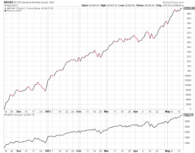
The top chart above is a daily chart of the S+P 500 showing the uptrend since the November 2012 low. As you can see there is a handful of micro bullish and bearish campaigns. The bears have caused corrections all in the vicinity of 46-60pts each while producing follow up rallies of 100 and 130 pts respectively.
 
The bottom chart is the cumulative advance - decline line of the New York Stock Exchange, it registers the amount of stocks advancing versus declining on a cumulative basis. So it gives you a look "under the hood" so to speak. As you can see the advance - decline line is indeed making new highs with this rally as well. So using this information and the fact the S+P 500 is trading well above it's decade long trading range without a significant increase in volatility leads me to believe this is indeed a real breakout.
 
Now I do expect another equal size 46-60pt correction to begin at any moment. Possibly around 1665 on the S+P 500. I expect to see support established and at the worse case scenario a drop back into the 2000 and 2007 bull market high levels which have been denoted on this chart as the 2 red horizontal lines. I do not expect the bears to get much more than that anytime soon.


Market Update: (Long Term) Investors Time Frame, The Rally That Just Won't Give Up!...


First off I want to address some questions my readers are having. I see there is some confusion that some people are having differentiating between my short term and long term analysis. Specifically how I could be looking for a correction but giving upside targets. To answer this question I will reiterate there are two time frames that we operate in, one is the short term or traders time frame. And the other is the long term or investors time frame. It all depends upon ones own risk tolerance and investment objectives when it comes to which category each individual falls into.

So to answer this question, I was bearish and looking for a correction in the short term. If I was a trader, which I happen to operate as one almost exclusively, I would be short. On the long term or investor's time frame I am bullish and would be long, only getting defensive at best until long term projections are achieved. I believe we are in the beginning stages of another long term macro bull market over the next decade or so. And I think the simple fact that this market rallies in spite of slow growth and bad news is a very clear and obvious sign of this fact. We can not wait until the flowers bloom and all the solutions to the global problems are established and made public. The S+P 500 would already be much much higher if that were the case.

So I hope that answers all the questions. Now as for the solution going forward, I have decided to break up my posts into the two categories. So investors or trader's can focus solely on the time frame they operate in.

Now on to the present state of the market on the long term investor's time frame. The chart above is the Dow monthly chart going all the way back to the year 2000. I believe the Dow gives us the best upside target projections so I am using it going forward.

First thing we should focus on is the green rising trend line connecting both the 2000 and 2007 bull market highs. As of May 2013 this trend line high is just sub 16,000 on the Dow and this rises each month that goes by. This is an approximation of course.

The second and more important thing to focus on is the projected high marked on this chart, which comes in around 16,645 on the Dow. This is static and won't change over time. In the simplest of terms, this projection comes about by taking a few calculations between the difference of each long term bull market high.

The last piece of evidence is the timing, as I hope I have shown you enough evidence to the fact in my posts over these last few years, the market very often replicates previous market moves in both time and price in each time frames. The time span between the last two bull market highs was 7 years (2000 to 2007). So a similar time span would project out to the year 2014 for a significant market top (2007 + 7 years). Also the last major bull market lasted approximately 5 years between 2002 and 2007. So we also come up with the year 2014 when we add a similar time projection off the 2009 lows (2009 + 5 years).

What we want is when time and price projections align. So armed with this information we can conclude a high probability of a significant market top somewhere in 2014 and somewhere in the vicinity of 16,650 on the Dow, with respect also to the rising trend line just shy of 16,000 as well.

I will wait to give my forecast of what to expect next after that market top is put in, but as of right now I would expect somewhere close to a 30% drop in equities before this market settles into what is now a new long term trading range to the upside!

Sunday, May 12, 2013

Gold Update: Important Key Levels for the Long Term


Due to recent price action in Gold I have been getting more and more questions concerning the long term trend and if the long term uptrend in Gold prices is still in tact. So I figured I would spend a few moments to create a new post on the subject. To begin let's go all the way back to the beginning of this bull market and analyze what has happened in the past and compare it to what is happening in the present.
 
To begin we start we the top most chart in this post which happens to be a monthly chart of the spot Gold futures contract. We see a long term bull market which began roughly around 1999 - 2000 and has moved up some 660% since.
 
Now let's take a look at the previous bear market corrections inside the long term uptrend. As you can see we have had four (not including current) corrections in Gold over the span of the last 13 years or so. The first two corrections produced declines of 24-25% respectively, the third came in 2008 and produced a 34% decline while the fourth only produced a decline of 15%.
 
Why do we need this information? Well we need to figure out first and foremost the supply and demand pattern for the particular market your interested in. Second we need to see if this is something unusual or status quo.
 
So if we now look at our current drop from all time highs, even though in terms of dollars it is the biggest drop we have seen, in terms of percentages it gives us approximately a 30% drop. So in this case it's so far not a move that is completely out of the ordinary. And we also remain above the 38% retracement level of this entire bull market run up. So given current market data the long term bull market in Gold is actually still intact.
 
Now going forward what should we be looking for?
 
The bottom chart is a weekly chart of Gold prices over the last couple years. On it I have highlighted a couple extremely key levels that will tell us all we need to know about the direction of Gold going forward.
 
The first key level above is strong resistance around $1526.70 - $1560.00. At any point if the market should trade above that level for any length of time, that would be considered very bullish and in which case we should be setting up for an eventual push to new all time highs above $2000.
 
The second level below is strong support and it comes in between $1266.50 - $1285.50. This area has confluence with the 38% retrace level of the entire bull market, previous bull market high support and matching 34% drop like that of 2008. This area should be strong support on any move lower, if the market would happen to spend much time trading below this level that would be a serious warning sign of long term trend change.
 
The third and final level below comes in around $1227.50. To me this would be my line in the sand for any future Gold investments. If the market were to spend time trading below this level, even though we could very well get a bounce, given the level of volume that occurred on last months breakdown, I would seriously doubt the bull market would resume anytime soon.
 
So I've laid out the current structure of the trend and some key areas to do business in. If I had to give my predictions I am leaning towards one last push lower to the $1266.50 - $1285.50 area, bottoming out and then making another run to one more all time high above the $2000 mark before all is said and done.  But we'll see.

Wednesday, May 8, 2013

Market Update.... Bears last stand?


Well I must admit that the strength of this rally has caught me a little off guard. What I am looking at as a potential "last stand" for bears is the OEX (S+P 100 index). I've mentioned this chart in previous posts before, it now becomes crucial for bears to defend as it remains the last significant resistance area for the near term.
 
The top chart is the OEX monthly chart showing the divergence between it and the S+P 500. As the S+P 500 trades at all time high levels the OEX has just now come into it's 2007 high. Also as confluence we have a measured move target projection just a tad above that significant high level.
 
The bottom chart shows this more clearly, it is a daily chart of the OEX off the 2011 lows showing two separate but distinct bull market campaigns. It seems to me to appear to be 2 separate bull market campaigns. The first came during the 2011 low to the May 2012 high consisting of a 100 pt rally off the low, a 60 pt correction with a final move up of 120 pts.
 
The second came during the June 2012 low and seems to be on it's final stage (hopefully!). Again we had 100 pt rally off the June 2012 low like in the last bull campaign, followed by a 60 pt correction. Now a 120 pt rally to match the size of the end of the previous short term bull market campaign projects a high of around 737.35, right in the vicinity of the 2007 OEX high as well.
It's because of this I am still holding out for at least a correction of the size of May to June 2012. But the strength of this market and the lack of volatility even at new all time highs for the Dow and S+P 500 has to make one cautious on the short side.