Saturday, December 21, 2013

Weekly Market Summary: Fed Finally Tapers!...


On Wednesday the Federal Open Market Committee (FOMC) in it's policy statement, made public it's decision to go ahead and begin the process of "tapering" it's QE 3 bond buying program at the sum of $10 billion a month. However also adding that:

"The Committee now anticipates, based on its assessment of these factors, that it likely will be appropriate to maintain the current target range for the federal funds rate well past the time that the unemployment rate declines below 6-1/2 percent, especially if projected inflation continues to run below the Committee's 2 percent longer-run goal."

In layman's terms it basically means we should continue to expect a highly accommodating monetary policy for as far as the eye can see. For a full briefing I would recommend visiting this link which takes you directly to the latest FRB Press Release. 

The markets took the news in stride and by Friday all four of the major averages made fresh new bull market highs. The S+P 500 chart above shows the trading range around support earlier in the week and the rally back up to the top of the short term trend channel. 


The Dow also found support the previous week and actually stayed above last week's low the entire week before also taking off higher to new highs.


The Nasdaq 100 also made a new high on Friday after finding support during the volatility that Wednesday's FOMC statement brought.


The Russell 2000 (Small Caps) is my favorite chart of the week. I've highlighted the symmetry this index has shown over the last 6 months or so. Each correction has been almost exactly $5 points in length before finding support and making new highs. This is about as picture perfect as you can get in these markets .

 A recap of the performance this week shows the Dow Jones actually coming in as the top performer with the Small caps not far behind. Emerging markets continue to struggle in part due to these changes in monetary policy.


The Advance - Decline line does continue to show an underwhelming divergence, however as I have highlighted, the last correction almost equaled that of the previous which occured during the debt debate and government shutdown. So although the bearish divergence persists there has been no follow through to break the upwards momentum thus far.


Taking a look at how the sectors performed relative to the S+P 500 for this week, we saw the strength come from the Industrial, Basic Materials, Health Care and Financial Sector. While the weakness was felt in the Utilities, Energy and Consumer Staples sectors the most.


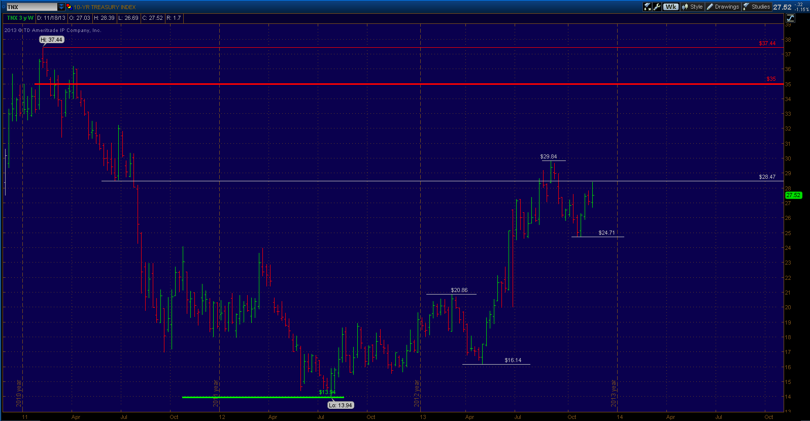
Taking a look at Bond performance for the week, Long Term Treasuries (TLT) ended the week with over a 1% gain while on the other side the TIPS (Treasury Inflation Protected) bonds suffered a small loss.


And finally, credit markets showed a little bit of uneasiness this week. Something I will pay attention to going forward. All in all the market continues it's ascent higher and there's really nothing to get overly bearish about at the moment. However it's most important to manage risk and maintain disciple, the temptations for many will be to chase these rallies with every penny they have and all the risk they can find. The key is to find the balance of putting money to work with realistic expectations and within your time frame and investment objectives. 

Saturday, December 14, 2013

Market Week in Review: Profit taking on Budget deal, all eyes await Fed policy next week...


This week we failed to see follow through to the previous week's rally, as the S+P 500 was unable to take out it's previous high, creating a lower high - lower low scenario. Last week we talked about the support zone below that the S+P did front run. Well this week we fell back down and this time we did hit that support zone below.

I am using this week's low at 1772 as the gauge going forward. Any weakness below that next week and the expectations would be for at least a drop to 1730.


The 60 minute Dow chart above shows the bounce off support and failure at resistance. Now we have a scenario where what was once support has now become resistance for the time being.


The expectations for any further weakness next week would likely push the S+P 500 down to the 1730 area as the next stop and could potential be the kick off to something bigger.


As for the Dow in the event of further weakness next week, the expectations would be that a drop back to 15,185 and it's 200 day moving average would be it's next likely downside target.


Performance by market cap this week saw the Mid-cap's "outperforming" while the small caps saw the biggest decline at 2% for the week.


Taking a look at the Volatility Index (VIX) we are starting to see a little more "flight to protection" as the VIX reading gets back above 15. The next important level would be 17 and most important would be 20. We have already seen two important lows in the stock market this year once the VIX hit 20.


The cumulative advance - decline line on the New York Stock Exchange continues to show relative weakness as it gets back into to the previous range below that it broke out and has now matched the size of it's drop it experienced during the first debt debate/government shutdown. This means less and less stocks are participating in the rallies and usually this will eventually end a bull market.


Sector performance compared to the S+P 500 this week shows relative strength coming from the Consumer Discretionary, Materials, Industrial and Energy sectors. And weakness from Health Care, Consumer Staples and Technology.


On the Bond side of the equation we saw the best performance out of the Invest Grade Corporate, TIPS and the 30 yr. The worst performers were High Yield and the 10 year treasury bond.


Some basic indicators gauging credit market health above, the first (spread between 2 year and 10 year treasury yields) is inverted so the lower the better. This most recent spike higher is worth noting but still trading at the lower end of it's range.

The bottom chart is the difference between High Yield bonds and Long Term treasuries using the most liquid exchange traded funds that track the spot price. This indicator continues to show relative strength in the credit markets continues. There is still not a whole lot of fear beneath the surface.

Next week will likely be all about the Fed and their FOMC statement and Economic projections on Wednesday. Traders and investors alike will likely focus exclusively on whether the Fed will "Taper" it's QE 3 program and when. I have no real opinions on the matter and have no idea what they will due on Wednesday.

However I think it is likely that the stock market continues it's rally if they decide not to taper now or in the near future. And if they decide to taper soon the market's initial reaction would likely be to continue it's descent below in the midst of it's short term uncertainty this event might bring. But as always, time will tell.

Thursday, December 12, 2013

Buyer Beware!!!

Taking a look at the technical structure of the major averages, most if not all look to be in pretty stable and solid up trends and returns across the board this year and the previous five years have been stellar. However in the interest of full disclosure I felt compelled to put together a quick post to highlight some potential technical headwinds going forward. Doesn't mean it will play out as such but it is always best to be prepared.

Dow on pace for 150,000???

BUY! BUY! BUY!

Over the past few years I have been pretty bullish over all as the two links above attest to. The second post above was created in June of 2012 and the S+P 500 is some 40% higher since. However as I have expressed in my weekly market summaries for awhile now, I remain cautious in regards to the downside potential in the near term. And I want to caution investors going forward.


This chart above tracks the price action in the S+P 500 since the 2009 lows. This current rally off the 2011 lows has now reached the same size (in terms of points) as the one preceding measured from the 2009 lows to the 2011 high before a 20% decline took hold.


Next we have a chart of the S+P 100 (OEX) which consists of the 100 largest cap, and most important, stocks on the US market. As the S+P 500 and Dow continue to make new all time highs the OEX is still below it's year 2000 high but nearing it. From it's most recent highs made two weeks ago, the all time high for this major average is around 3-4% away.


Perhaps the most significant is the Dow Jones Industrial Average. Above is the chart going back over 15 years. I posted this on the blog a long time ago as a major upside target. There are many patterns here signaling a potential top in 2014 around the 16,600 level. As every time over the last 15 years the Dow became this overextended above it's previous bull market high it found some significant resistance.


Here is the updated version of the previous chart.


Now I follow historical market technical patterns and those of you who follow know I love to compare this current long term trading range to the one that occurred during the time period of 1966-1982. Though not perfect, it's amazing how closely the two charts have been playing out so far.

The above chart is the long term trading range of 1966-1982 and if things continue to move in unison we may well be at the tail end of wave  number 7 up. At that time what proceeded was a 28.5% drop in the S+P 500 from 1980-1982 (141.96 to 101.44) before finding support for the one of the biggest and best bull market runs of all time into the year 2000.


I have thrown up another current Dow chart with wave counts to compare the technical structure of this current formation to the one that developed in 1966-1982.


So if in the case solid resistance is found sometime in the near future and we do indeed break the momentum of the uptrend the expectation for me would be a drop into long term support below, which for me is defined between the QE 3 announcement high of 1474.51 and the May 2011 highs before the major averages shed roughly 20% on Euro-Zone concerns.

This would roughly match the 28.5% correction size experienced in 1980-1982 and may very setup for another major move to the upside over the next decade on more. Only time will tell on that.

Of course this doesn't mean that these patterns must continue forever. The only purpose of this post is to highlight some potential technical headwinds going forward. I believe I have made a case for the potential upside in the near term to be limited and the risk to reward at these current levels potentially not being ideal. Investors should be cautious but also cautiously optimistic in the long term in the hopes that things will continue to improve.

Saturday, December 7, 2013

Stock Market Summary: S+P 500 finally breaks it's 9 week winning streak...


The markets finished the week strong off a solid NFP employment report, however still could not close positive for the week and in turn ends the 9 week winning streak for the S+P 500. The major average experienced a short term correction leading into the report, adding up to an approximate drop of 30 points from highs. This drop was in line with the previous short term correction off the highs at 1775, which equated to roughly 30 points as well.

Although the drop didn't quite reach strong support which is defined on the chart above between 1775 and 1777, Friday's clear rejection of prices below signals that the low at 1780 that formed this week likely ended the correction. So far I see no selling pressure that breaks the rhythm of this current up trend. The expectation now becomes an upside target around 1850 in the S+P 500.

 
Even though the S+P 500 did not quite make it to support, the Dow did in fact underperform and probe lower into it's strong support equivalent as defined on the chart above. The Dow chart looks a little more concerning as it in fact saw it's biggest decline since the October low and is underperforming since. I would need to at least see a push back above 16,030 (Red Horizontal line) soon and it is worth monitoring in the mean time. A failure would likely take the Dow back to the 15,500 vicinity in the near term.
 
If you have followed the web site you know my feelings on the overall trend being overextended at this point. So any and all signs of weakness really needed to be treated with respect.


Another note of caution comes from the cumulative advance - decline line which from the chart above clearly shows bearish divergences as fewer and fewer stocks participate in the rallies. This in of itself is not a bull market killer and certainly not a market timing tool however.


A performance chart for the week on the major averages show the Nasdaq 100 as the top performer and the Small caps Russell 2000 as the underperformer, possible risk off?


The major averages year to date chart above show the small caps and Nasdaq 100 as the leaders with 28% and 30% gains year to date. With the blue chip Dow index coming in around 22% gain for the year.


Taking a look at the sector performance relative to the S+P 500 for the month of November shows the strength coming from the Financials, Health Care, Discretionary Consumer and Technology. With Energy, Consumer Staples and Utilities underperforming.


Sector performance year to date relative to the S+P 500 shows the strongest performance coming from the Consumer Discretionary, Health Care (mainly Biotech), Industrials and Financials. The relative weakness is seen in Utilities, Materials, Energy and Technology.


Taking a look at the other major asset class, that being the Bond and Credit markets. One simplified way to gauge the health of the credit markets is looking at the difference between the High Yield and Long Term treasuries. This chart above does just that as it shows new highs being made meaning investors still willing to accept risk.


Another indicator shows the spread between the 10 year and 2 year bond yields. Like the previous chart, it too is at highs showing relative health in the bond market in a simplified format.


In terms of performance, this week most if not all bond types were in the red. With the TIPS (Treasury Inflation Protected Securities) and long term treasuries being the worst performers and the High Yield and Investment Grade Corporate Bonds being the "least bad".


Performance year to date looks relatively the same. With long term treasuries and TIPS down 12% and 8% respectively. The short duration and High Yield bonds showing the only positive returns for the year.

So in conclusion, this current up trend is still intact but showing some minor cracks that deserve closer monitoring going forward. It is still my opinion that a good 20-30% correction is close at hand but will need clearer internal signs of weakness to even begin to guess when and where it may begin.

Thanks for reading, hope you enjoyed. Feel free to email me with any questions, comments or inquiries of any kind at mgouvalaris2002@verizon.net.

Saturday, November 23, 2013

Stock Market Summary: Dow above 16,000 and S+P 500 above 1800 to end the week...


The S+P 500 and the Dow both closed the week at new all time highs. 1775 in the S+P 500 was key and it reacted very well. The next measured move upside target will now take the S+P 500 up to 1833 in the near term. In the long term I still maintain the market is getting quite overextended but another 3-4% upside is realistic.


The Volatility Index (VIX) remains very low, each time this year that the VIX hit 20 it became a reliable buy signal. A VIX below 20 generally suggests that pullbacks are short lived and shallow, more of the 4-5% variety, which is what we have seen.


The cumulative advance - decline line continues to show bearish divergences. This indicator has not moved much higher since the May highs meanwhile the S+P 500 is roughly 6% higher above it's May high. This means the advance has been occurring with fewer participants and is usually a precursor to a significant correction. However this is not a timing tool and these divergences to go on for awhile before it eventually settles itself out.


Three of the nine sectors within the S+P 500 also made new highs on the year. Those being Financials, Energy and Health Care.

 
Year to date relative strength in this market comes from Health Care, Discretionary, Industrials and Financials. Underperformance comes from Materials, Tech and Utilities.
 
 
The US Dollar continues to find support around the $79 level, it's year to date performance has been roughly flat. I am watching the lows at $79 going forward, as the last time we had a significant drop in the Dollar, it eventually put downward pressure on equities in 2011.
 
 
TLT (Bonds) found support again at $102 this week. Upside resistance now stands at $111.50 and $118 as denoted on the chart. Next support level below comes in around $96-$97. At that point it would about match the size of the drop during the 2009-2010 correction, which happened to be the biggest correction seen since TLT was introduced.
 
TLT would need to find support there or $87 will eventually get taken out afterwards.
 

The yield on the ten year continues to hold above 2.5% after nearing the 3% area. It has completed a correction about the size of the one that took place early this year. The next upside comes in at 3.35% and downside support stands at 2.25%.


In conclusion, a look at year to date performance among asset classes. Obviously it's been a tremendous year for equities with Small Caps and Large Cap Tech leading the way with above 24% returns. Emerging markets are the laggards, with growth and "Taper" worries weighing heavily.

Wednesday, November 20, 2013

Stock Market Update: 1775 in the S+P is Key...


This week we saw a key psychological level in both the S+P 500 (1,800) and the Dow (16,000) get tested for the first time. So far it has proved to be short term resistance. The 60 minute chart above shows the recent price action.

After reaching 1775 we created a short term trading range of 29 points that formed an inverted head and shoulders pattern. This week we narrowly missed the upside target of that pattern at 1804 with a high of 1802.33. Downside support now stands between 1775 and 1773 as previous swing high and low pivots that would match the size of the biggest sell off since the lows of 1646 were formed last month.

Any continued weakness below support would break the rhythm of the market and possibly signal a change in trend. Given the technical structure of this current market and the potential of it being overextended I believe any such weakness should be taken seriously at this stage of the game.

Tesla (TSLA) Price Chart Update...


Tesla continues to trade lower in search of buyers, many are saying the momentum in the stock is broken. In terms of the short term trend they are correct. I think we have done a pretty good job of staying in front of this stock in terms of technical. We pointed out a couple weeks back that $180 was going to be resistance pre-earnings and how the failure below was likely to take the stock price closer to the $115 level. And so far that is exactly what is playing out. So now let's look at the big picture to see how this stock has reacted in the past.

This daily chart above shows price action off Tesla's IPO in 2010, into early 2013 just as the stock went parabolic. As we can see this stock is no stranger to volatility. Off of it's Initial Public Offering the stock proceeded to drop 50% from $30 to $15 dollars a share before finding support and making a new high.

Now each time the stock made a new high it proceeded to correct 42% the first time and 36% the second time. So basically once a year since it's inception this stock has experienced a significant correction. Quite typical for a new stock and a new technology working out the "bugs".


So now in light of that information, the current correction in Tesla doesn't look all that bad just yet. In this daily chart above we see the price action for 2013 and see we are clearly in our "once a year correction" mode.

From current lows from yesterday at $119 we have a 38% correction which is right in the sweet spot of the previous years drops. Coming into potential strong support below at $115 and then $104.50 with a 200 day moving average coming in around $108 as well.


Since this is quite a volatile stock the most prudent thing to do here may be to wait for buyers to show up again and ride the momentum back up. One thing I do to judge momentum is to measure the size of the retracement rallies and see if buyers can break the pattern of weakness.

So on the 60 minute chart above we can see the price action going back to the all time highs at $194. Each retracement rally has measured roughly 28 points in length. So if yesterday's low at $119 holds the next projected resistance would come in at $146.32 - $147.58.

If we can see continued strength above that resistance zone or if we make new lows, a greater than 28 point retracement rally off that low would be your first sign of potential change in the short term trend.