Saturday, August 24, 2013

Market Update: A look at interest rates during QE's and is the correction over?


In times of uncertainty and increased volatility, I find it prudent to take a look at the bigger picture. Most of the time I find that we can eliminate a lot of the outside noise and distractions that get perpetuated by the media, and come up with a clearer, rational plan of attack when we simply look at what has happened in the past and compare it to what the current environment is.
 
In the chart above (weekly S+P 500) I have highlighted the last 3 corrections along with this most current one. On June 2012 I created this post that challenged readers to look at the big picture and look for value as opposed to being hypnotized by the headline news. The next week the market bottomed and proceeded to move some 40% higher over the next 12 months. Although I do not have the same conviction on the buy side at these price levels 12 months later, I do believe there is still value to be found and some more upside to be discovered before a correction of 20% or more commences.
 
So we see in 2012 we had 2 corrections of roughly 9% and 11% lasting 9 weeks in length. This year we had a 7.5% correction that lasted 5 weeks and so far we have a 4% correction lasting 3 weeks. So we could have another 2-3 weeks or more of potential downside, but as of now we can see this is not anything that we haven't already seen.
 
 
Now here is a look at the Dow Jones Industrial Average during the same time span. Two correction of 8-9% spanning 5-6 weeks and this year we had a 6% correction lasting 5 weeks. So far we have a 5% decline in 3 weeks.
 
 
This week the Dow has hit some strong short term support which could provide a solid bounce across the board of major averages.
 
 
Any further weakness below this week's low would signal to me that the Dow would likely be headed back to test it's 2007 bull market high around the 14,198 area. This would be a healthy correction with confluence to match.
 

I believe that drop in the Dow (which has underperformed the S+P) would coincide with the 1597 level in the S+P 500. I believe some strong support emerges here. Resistance now comes in at the 1675 level and 1685 level going forward. This week we hit some short term support at 1642 which we pointed out in last week's review post.


TLT, or the very popular long term treasury etf, came into strong support this week defined as the weekly unfilled gap from July 2011. There is some strong support also in the $98 level, I think the next big short term move will be higher.


Taking a look at the 10 year treasury interest rates once again because it seems to be a hot topic of discussion right now. I have highlighted how interest rates have moved during each of the Federal Reserves Quantitative Easing programs. QE 1+2 produced a 1.41-1.55 basis point rise in yields.

So this week we have hit the "zone" in which matches the size of the rises in interest rates in terms of basis points. It is likely the next short term move is to the downside, which inversely would be good for bonds. However since I do not believe QE 3 will be completely finished until sometime next year, I think it is very likely we make our way to the next upside target around 3.37% before all is said and done.

It is worth noting that although we have just now match the size of the previous moves higher in terms of basis points, in terms of percentage moves this current move higher has been larger, basically doubling off the all time lows.

Taking a look at the advance - decline line we see a little improvement to end the week, but remain relatively weak overall.


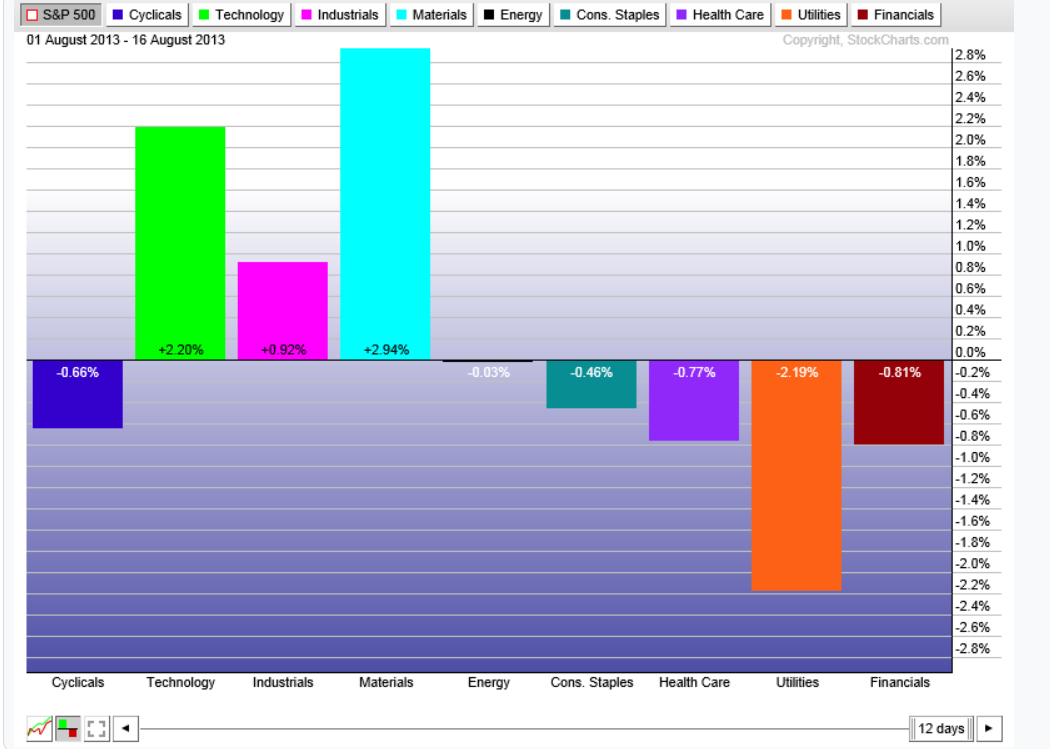
Here's a look at sector performance since during this current correction. It doesn't matter which way you look at it, Utilities continue to be the worst underperformers while interest rates are rising.


The economic calendar for this upcoming week, to end the month of August, remains relatively light. Tuesday we have consumer confidence and Thursday we have a preliminary GDP q/q announcement. Saturday China comes out with their latest Manufacturing PMI reading.

In conclusion, there is no way we can tell if or when this correction will be over with absolute certainty.  Personally I believe we have some more downside remaining over the next few weeks. Once we broke back down below 1700 and failed to get back above we had to assume this was the beginning of a correction. I have pointed out a strong support level for both the Dow and S+P 500 that I believe will hold going forward. I fully expect the S+P 500 to trade over 1750 in the coming months and the Dow to hit our long term upside target around 16,600 over the next 6 months or so.

But really the purpose of this post was to give readers a look at the big picture. Hopefully it will help give a little better perspective and plan of attack going forward.

Saturday, August 17, 2013

Stock Market Update: S+P 500, Small Caps, Gold, Interest Rates and Cisco earnings...


This week we got our resolution to the short term trading range that we talked about in last weeks post. Thursday on the back of some disappointing forward guidance by Cisco and Wal-Mart, the major averages gapped down and decisively broke the previous support levels below. Before we proceed into what to expect next let's take a second and review what has happened off the June lows from a technical perspective.

The chart above highlights two consecutive trading ranges equated to 66 and 70 points in length. We broke the second trading range to the upside but failed to stay above that prior range. That was a caution sign as most genuine breakouts do not reverse back inside the previous range that fast. The second warning sign was the failure on two separate occasions to then get back above the previous trading range defined by the 1698 high.

So now we find ourselves in the midst of a correction, another thing of note in the chart above is how after we broke out of the first trading range, how we kept going straight up leaving three open price gaps in a short amount of time. This leads me to believe this correction is more of a "back and fill" setup than the start of a bigger correction. And as long as we can stay above 1626 I don't see any reason to give up on the long side just yet. However as I will point out in the conclusion, the cumulative advance - decline line continues to deteriorate.


The small caps did an excellent job of projecting a possible swing high. Using a daily chart of IJR above we can see three very distinct and equal sized trading ranges making higher highs. A failure for me would be defined by a move back below $93.27 or the top of the previous trading range. Otherwise I see now reason why this fund will not trade up to $103 or higher over the coming months.


So what can we expect now? Well as the above chart shows, Friday's decline has sent us right into some strong support that we have talked about before, defined by the 38% retrace level off the June lows, and a previous swing high, a 50 day moving average. Another level to watch is the 1626 level, that was the scene of a major breakaway gap which also turned out to be the top of the first upside trading range. This area will be my line in the sand going forward. Above that level and I see no reason we can not continue to make new all time highs.


Taking a look at Gold, GLD chart shows a clean breakout above this week. We talked about the fact that as long as we held the high of the previous trading range, it looked like Gold was poised to have just this type of move higher. Next upside target comes in around $138.30 - $139.00.


Taking a look at interest rates, the ten year yield this week has hit a big target of mine as mentioned in a previous post only a few weeks ago. To me this has the potential of becoming at least a short term exhaustion point, I would not be surprised to see the next move in the ten year take it back down to the 2.3% - 2.4% area. However longer term I expect rates to continue to rise, although hopefully not at this pace.


The one chart (above) that all bulls should be concerned about and paying close attention too. The cumulative advance - decline line continues to deteriorate and is in danger of confirming a double top. We pointed this divergence out weeks ago, that as the S+P 500 made a new all time high the market breadth failed to follow along. Although this is not an exact market timing tool, it is easy to understand that the major averages can not continue to march higher if breadth is not moving alongside. We will continue to monitor this development over the coming weeks.

Taking a quick look at the sector performance during this correction off the 1709 highs. We can see Technology, Basic Materials and Industrials showing relative strength while Utilities continue to see weakness. Although this is a small sample size due to the correction only being in it's 12th trading day.


I wanted to conclude by taking a look at Cisco (CSCO). Wednesday afternoon's earnings release caused some selling in the stock and it now finds itself over 7% down from most recent highs. Taking a closer look I believe a strong case can be made that what we saw was a result of more profit taking as opposed to something else. The weekly chart above shows the stock price nearing strong resistance as defined by the 2010 and 2008 bull market highs and the stock had already matched the size of the last short term bull market. Going forward, from a technical perspective I believe the worst case in this stock would be a move down into strong support in the $21-$22 level.


Here we see a daily chart of CSCO showing Friday's price action has now taken us back into support defined by the initial breakout day. Also note the difference in volume during this week's sell off compared to last quarter's breakout higher.

I believe this stock is headed to $33 level over time and likely trade up to $40-$45 over the coming years.


This week's economic data is highlighted on Wednesday with US Existing home sales and FOMC meeting minutes. On Thursday and Friday we have the Jackson Hole Symposium, Fed Chairman Ben Bernanke will not be attending so I would reason there will not be a whole lot of new information. However I am sure short term traders will find something in the statements to take a side on.

Wednesday, August 14, 2013

Apple stock price update: How quickly sentiment can shift....


A couple weeks ago after Apple reported it's latest quarterly earnings, we posted an update on the stock price and what the technical setup appeared to be. We were near term bullish for technical reasons and at that point the stock price was trading around $418. Today we have seen the stock price rise back up above $500 a share for the first time since January. A big reason may be Carl Icahn's announcement yesterday via twitter that he indeed has a large stake in the company.

Taking a current look at the technical picture it appears as if the stock price is headed back up to retest that broken trend line that is depicted in the top most chart above.

The second chart is a daily chart showing a clearer picture of the near term trend. I expect shares of Apple to trade in the $545-$555 range as the next near term target. As annotated on the chart, there happens to be a few key confluence elements that come into play. The midpoint of the drop from all time highs, estimated top of next trading range and broken long term trend line all line up in this range.

It appears some of the excitement in Apple is starting to come back again. I really have no idea if we will see new all time highs again anytime soon. However if we can trade above that $545-$555 range for any length of time that would be a very good technical sign for the future of this stock price. Until then I think it is prudent to not get too sucked into these extreme sentiment shifts in either direction.

Saturday, August 10, 2013

Market Update: S+P 500 short term trend, market internals and a 1987 style market crash?


With the bulk of the earnings reports already completed and very little market moving economic data this week, the markets lacked a catalyst for short term direction. The result became a relatively range bound, uneventful trading week.

In our short term market update post this week, we did a decent job highlighting what became the short term bottom. The chart of the S+P 500 above (60 minute) highlights that support zone as well as the resistance zone above, which is defined by the 61% retracement level and previous swing high. We remained inside this trading range the entire week.

Next week I am expecting a resolution to this trading range. A break out above 1700 would signal to me that the rally to 1740 and 1770 is underway. A break below would mean a retest of the 1676 low, and likely a drop into the 1655-1660 support area before our rally to 1770 commences.


I continue to monitor the cumulative advance - decline line, as we pointed out the double top and divergence some time ago. The sooner I see this double top taken out to the upside, the better I will feel about the long side. However continued weakness below the last major swing low, as highlighted on the chart above, would have very bearish implications for the longer term trend.

Sector performance year to date remains relatively unchanged from the previous week. Financials dropped one notch and basic materials moves a little closer to entering positive territory for the year.

The economic calendar this week looks relatively light as well. We have some retail sales data coming in on Tuesday which could potential be a catalyst for a breakout of our short term trading range. Ending the week on Friday with the University of Michigan Consumer Sentiment report.

 
In conclusion: we are hearing increased chatter about the similarities that lead up to the 1987 stock market crash and what we currently have going on today. While I am not hear to debate whether a similar style crash could happen (anything is possible when it comes to the stock market). I thought I would offer some food for thought regarding the differences between the two time periods as well.
 
This chart above is a quarterly chart of the Dow Jones Industrial Average off the generational low in 1974 an into the 1987 crash and beyond. It shows a 380% gain from low to high which would equate to around 3000 on the S+P 500 today. Also it included a 155% gain over a 3 year time span without a correction greater than 11%. That would also equate to roughly 3000 on the S+P 500 off the 2009 lows.
 
The truth is no one knows exactly how it will all play out with 100% certainty. The only thing we as individual investors can control is how we react and interpret to current market data. The truth is the markets do not care about anyone's opinion, no matter how good that opinion might be.  

Wednesday, August 7, 2013

Market Update: Short Term (Trader's) Timeframe...


Today's sell off has brought the major averages into some notable short term support that I believe deserves attention. The top chart above shows the S+P 500 coming into support that is defined by the May 22nd high and the open gap left behind on the breakout from our most recent trading range. The bottom chart shows the Dow coming into an area that provided support on a few occasions. It would appear to me that strong support in the near term, comes in around the 15,400 - 15,350 range.

Also of note, both major averages have now about matched the size of the most recent correction.

Fed chairman Ben Bernanke is scheduled to speak at 2:30pm est. Followed by consumer credit at 3pm est.

Saturday, August 3, 2013

Market Update: S+P/DOW, Gold, US Dollar, Internals and Sector Performance...


This week we saw continued upside momentum in the major averages as the both the Dow and the S+P 500 made new all time highs. As we broke out of the last trading range we can then compute a logical upside target going forward. The two charts above give us potential upside targets using most recent market patterns. The top is of the S+P and it shows a projected upside target of around 1770 with 1740 coming in as a potential resistance point as well.

The bottom chart is of the Dow, similar setup and it points to an upside target coming in around the 16,125-16,150 range. Taking us ever more closer to our long term upside target in the Dow (chart below).


Taking a look at the market internals in the chart above, we see a continued divergence in the advance - decline line versus price action in the S+P 500. Now it certainly is not unprecedented to see such a divergence, but in order for this market to continue it's advance higher (which I fully believe it will) we would need to see a break out in the number of advancers to coincide with this recent price action, and relatively soon. We will continue to pay attention to this going forward.


Another important indicator I like to look at is the number of stocks in the S+P 500 trading above their 50 day moving averages. It tends to do a pretty good job of spotting exhaustion points on both the upside and the downside. I've highlighted the key ranges I like to look for. When we get readings of 450 and above that generally gives me "cause for pause" when long. And on the flipside a reading of 150 and below usually gives me "cause for pause" on the short side. Currently our reading is 411 so we are nearing overbought territory, but still have room to the upside.
 
 
This week I wanted to touch on Gold a little bit. Our last POST on Gold did a good job of pointing out some near term resistance. That resistance has indeed come to fruition, so now let's talk about where we go from here.
 
The chart above on GLD shows us support in the $125 level which matches the size of the last correction and fills the open gap below. The next support level below around $122 or the top of the first trading range box, would in my opinion be critical for any further upside in GLD. As long as we can hold those support levels I do not see any reason that GLD then can march up to the $138 - $140 price target. A failure at support would signal to me that we have a very good chance of revisiting the top of the 2008 inverted head and shoulders pattern around $1000 level on the spot Gold.
 
 
Next let's take a look at the US Dollar, in the chart above using UUP, an etf that tracks the US Dollar spot futures contracts. As you can clearly see that the Dollar remains in a downtrend going back to 2008 on this chart and even further than that. It's been relatively range bound for the last year or so which could be a potential sign of a base building pattern for a strong move upwards. However we still have the trend line above and the $23.34 level (midpoint) shown as the white horizontal level above, as resistance. For support below, we have $21.50 - $21.75. Until we see a clean rejection of prices out of this range it remains a tough trade at current levels.
 
  
Sector performance year to date remains relatively unchanged.

Thursday, August 1, 2013

Exxon Mobile (XOM) post earnings...


Exxon Mobile reported earnings this morning, and according to Morningstar the company's second-quarter earnings fell 57% amid weaker refining margins and volume and as the year- earlier period included a net asset-sale gain of $7.5 billion. Exxon Mobil reported a profit of $6.86 billion, or $1.55 a share, down from $15.91 billion, or $3.41 a share, a year earlier. Revenue decreased 16% to $106.5 billion.

From a technical perspective, even though the stock price today is under some pressure (as it's been down almost 2% intra-day) the uptrend still remains intact. The chart above is a weekly chart showing price action in the stock, going back to 2010. I believe as long as the stock price can remain above that trend line it is not time to jump ship just yet. Although from a fundamental perspective it probably makes sense to be cautious.


Taking a closer look using the daily chart, we can see today's drop has indeed found support at the midpoint of the most current trading range that coincides with a previous open gap or settlement price. We should have a lot of support here and into the $90 level. As long as we remain on the positive side of that trend line I see no reason why this stock price can not eventually hit a target price of around $99-$100.